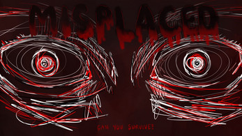
Misplaced
CONTROLS:
W, A, S, D - movement
Z - dialog
E - interact with certain items
I - inventory
P - pause
Left Mouse - clicking on buttons and inventory items.
Overview
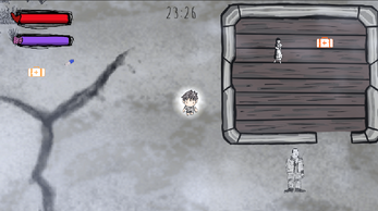
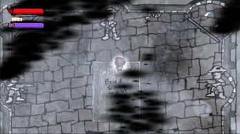
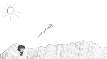
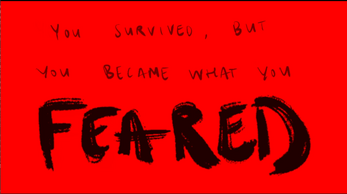
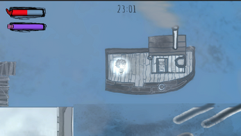
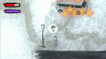
Out team released a game that is all about survival during conflict, the cycle of violence, & inspired by real life ev…well you know what. It’s meant to be from a child’s perspective, which alongside the graphic novel, Footnotes in Gaza, influenced much of the art direction. This game is meant to partially subvert typical gameplay as the player is often punished by having their sanity diminished for grabbing every item they come across. NPC dialog offers many clues on how to traverse the game with the most sanity intact, but your sanity bar does not determine your ability to beat the game. It merely dictates, which one of the multiple endings a player might receive upon completion.
Development Process:
Brainstorming:
This project began with a brainstorming session on what type of game we wanted to create. As we reflected on current events, we came up with the idea of depicting a scenario where our players would fight for their life in the middle of an armed conflict that would be meaningful and more like an interactive experience. We drew some of our inspiration from games such as Don't Starve Together, TWELVE MINUTES, This War of Mine, as well as the graphic novel, Footnotes in Gaza.
Building Process:
From the very start, we divided the design process into three scenes and we divided the workload between the three of us. We had a couple of kick-off calls to lay out the storyline we would like for the game, and then laid out all of the major mechanics for each scene.
Afterward, we also had a list of each art asset we needed to create in-house. Hanna was mainly working on the art creation and animated cut scenes, while Roshan built the 1st & 2nd scenes, and Tian built the 3rd scene. Once we had all the mechanics laid out, we replaced all of the temporary art place-holders.
Playtest Feedback:
From two playtests, here are some notes:
- We need clear visual instruction: how to control the character, how to interact with NPC or environment elements
- when life/sanity is decreasing, we need to make it more obvious that the player is hurting
- Some of the elements in 3rd scenes have negative z value, which should not be the case
- UI Font: to change it into something that fits into the world setting
- Adding fade-in: between the scene
- Update the key item in the 3rd scene to make it fit into the story: replacing the sailing licenses with the key
- Soldiers in 3rd scenes, when chasing players, want to make them able to shoot a bullet
- Rigidbody: we have one rigid body attached to the player's parent and another attached to the player's child as the feet. This setup has caused some issues when player push objects or pick up items
Revisions:
From both playtest feedbacks, we made some changes to our build within a limited amount of time:
- We streamlined the player’s journey, adding more visual pop-up roads as the environmental design to guide the player and also leaving some space for players to explore themselves
- Roshan set up the audio cues for decreasing health and sanity, which is triggered whenever players take damage. This way, it would be clearer when the player is taking damage.
- We did an overall bug check for all elements in our scenes to remove the Z value to make sure it is not causing any collision issues
- We updated the time-count-down font and also replaced the pixel sanity bar with Hanna’s new sketch to make it clearer to our players.
- Updated the NPC dialogue and key items in the third scene to make it more convincing storytelling.
- Updated soldiers in 3rd scenes, adding stop trigger, player detection, and walk animation
- Rigidbody: We did not end up removing the rigid body on the player’s child. Instead, we fixed interactive elements in each scene because many of the scripts are set up as detectors of both player’s rigid body and its’ child’s; if we simply simplified the rigidbody structure, most of the code would not work, and it may cause much greater delay.
Postmortem Devlog
Success:
Overall, we are proud of what we have accomplished. Considering the amount of art assets and level of design we had, we achieved most of the main mechanics we thought about. Also, because we were able to create a soundtrack and art sprites ourselves, we built a believable world for the character. Especially the design for sanity, which connects the postprocessing visual design with our puzzles or moral choices design.
Challenges:
Some of the key challenges we faced were:
- Creating the art: All of the artwork was handmade by Hannah and Roshan.
- Sound and Music Design: Similar to art design, Roshan designed all the audio cues and built those into the player controller script. So whenever a certain function is being called from a player’s behavior, we have an audio effect accompanying it to indicate to players what is occurring. The soundtrack was also created by Roshan, which added to the immersive experience.
- Player’s rigid body: the way it interacts with the environment(pushed boxes, bullet, knockback, interactable NPC)
- The general layer and Sorting layer of game object: Because we are working on something that has so many different elements(NPC, solid object, grass, ocean, animated background). We spent a lot of time playtesting/bug-fixing the interactions between each layer
- Count-down system: Roshan built the count-down system on top of the screen as a key element to the game, where players are constantly facing the pressure of finishing the game before the timer runs out.
- To play with Canvas and make sure the system is successfully carried to the next scenes is crucial.
- Health/Sanity Manager: As we mentioned before, having both health and sanity is the first thing we thought about. Tian worked on the rough draft of the health manager system, which involved canvas, slider elements, and calling different types of damage from different scripts(burn the tick, bullet damage, bomb damage, sanity damage on collision, etc.). Later, we also refined it by combining multiple damage scripts with the master health/sanity manager.
What we learned:
For us, the greatest lesson we learned was how to design a game as a team that we could deliver by a set deadline. We had to really think ahead about how we wanted to divide the work and collaborate on this project.
Further Improvements
- some of the item pick-up stuff isn't always consistent.
- some of the bullets don't point the correct way in the third scene
- more sanity effects, more endings.
- The brother NPCs should also disappear when their arc is done
- Rescuing the "trapped" NPC out of boulders could have more polished
- Perhaps a missile launches on the screen and add an electricity effect for a fence
- Incorporate a day & night cycle
- An updated dialogue system: letting NPCs have different branches of reaction/dialogue, where player choice will matter.
Credits: all visual art assets were hand drawn by Roshan & Hannah. All of the SFX and music were made and composed by Roshan except for 4 sounds: the ocean waves, the fire sfx, the air siren, and the little girl laughing. These four sounds were all procured from freesound.org.
Download
Click download now to get access to the following files:
Comments
Log in with itch.io to leave a comment.
I really love the art style and atmosphere of your game; it conveys a sense of oppression and fear. If you could add more background, I believe this game could have a compelling backstory. The sound design also fits the content of the game perfectly. If possible, it would be great to add some text to reflect the hidden meanings within the game.
I really like the hand drawing style for the game assets, they really fits well with the dark/sad theme of the game. Some nitpicking thoughts: maybe the character could move slightly slower, the movement feels a little fast for a kid, and could also fits the sad theme better. A little more instruction on the interaction/wayfinding would be nice too. Overall great game!
Your art style has always been very colorful. It's beautifully done from the opening to the end. I think the narrative part is well thought out and has a well developed backstory. But in a way I as a player don't feel your narrative. My suggestion is that maybe besides talking to NPCs, you could add some NPC actions or trigger some extra events instead of just picking up stuff and taking medicine. Also how you balance your music material is important, players who are constantly startled by sudden sound effects may not be able to immerse themselves in the game.
Very moving story, very sad to play. I think it would be interesting to lean into the unfairness a little more; while some areas are briefly dangerous, most of the map still feels relatively chill to roam around in. More stealth sections I think would make sense here.
The references throughout the game to the boat and the ocean as goalposts felt quite foreboding. Knowing the tragic fate of many refugee families who try to flee oppression by boat, I did expect an unhappy ending here.
I love the fact that you have an intro and that you also have the option to skip it makes the game feel complete in a way! I think that the music you chose also feels very fitting to the theme. I did find my self getting a little lost in the map but perhaps this exploratory vibe was what you were going for. Maybe some more signaling would have been good to have.
AMAZING soundtrack! amazing tech know-how and execution. Even though I understand that the third level did not fit the plot, I still wish you had kept it. If I were to add anything, it would be a map of the game's top view, which could also be used for navigation. Additionally, I was unsure of how to respond to some interactions because they were not as intuitive as others.
Great design and sound design. Playing it is emotionally impactful. I understand there is sometimes no map in real-life escape settings during war, but I do think this would be helpful to add to your game. I found myself getting really lost and having to navigate a huge playing field to try to find my way out and interact with NPCs to have an answer.
I said this during a previous round of playtests, but it could also help to clarify the boundaries of the game so that the player knows where they can walk or where they will be blocked. Maybe in addition to/instead of the map, you could have text call-outs that explain to the player where they should go next. For instance in the scene where you blow the horn (also can't remember if there was a horn sound effect?), it could say something "The soldiers stationed above are coming your way! Make your way to the port before they make their way to you."
Finally, the game could close on the arrival of the person at a refugee camp/border patrol rather than just ending on the boat. This will drive your point that the person is traumatized and will face further hardships home.
I remember playtesting this game during one of your first playtests and was able to get through your game without much hassle. I'm glad that your group made the conditions to beat the game more airtight to keep the player within the narrative at hand because from my past experience with your game I was able to skim some of the story.
One of the things I would recommend to improve for a future build is to maybe see if you can update some of the UI textboxes. Maybe for stuff like dialogue and picking up important items there can be sound effects that can go with them so the player knows that these elements are ones that they should pay attention to.
Really like where it is! I like that you have a full narrative/game loop in your game.